


Visual Identity

Logo Don’ts

Ensuring proper use of our logo will create cohesion across campus, as well as increase brand recognition of the brand. Included here are examples of how the logo should not be used. While this is not an exhaustive list, we urge you to use your best judgment to use the logo in a way that does not affect the legibility, recognizability or essence of the logo.

Do Not

  • Do not recolor.
  • Do not rearrange or resize elements.
  • Do not outline.
  • Do not rotate at angles other than 90°.
  • Do not warp, skew or stretch.
  • Do not crop.
  • Do not use drop shadows or effects.
  • Do not use as an image container.

Contact University Communications & Marketing at marketing@winthrop.edu if you have questions and/or need guidance.
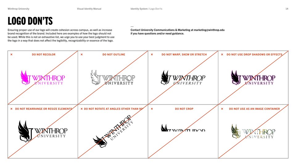
Examples of incorrect logo usage including recoloring, rearranging, outlining, rotating,
                     warping, cropping, adding effects and using as an image container.
Logo don’ts from the Visual Identity Manual.