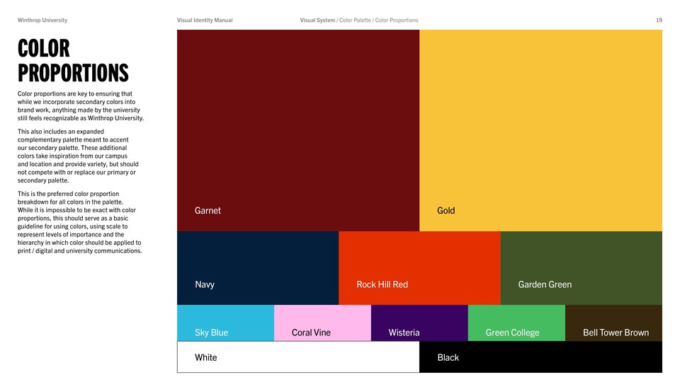




Color proportions are key to ensuring that while we incorporate secondary colors into brand work, anything made by the university still feels recognizable as Winthrop University.
This also includes an expanded complementary palette meant to accent our secondary palette. These additional colors take inspiration from our campus and location and provide variety, but should not compete with or replace our primary or secondary palette.
This is the preferred color proportion breakdown for all colors in the palette. While it is impossible to be exact with color proportions, this should serve as a basic guideline for using colors, using scale to represent levels of importance and the hierarchy in which color should be applied to print / digital and university communications.