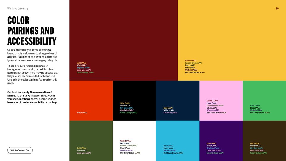




Color accessibility is key to creating a brand that is welcoming to all regardless of abilities. Pairings of background colors and type colors ensure our messaging is legible.
These are our preferred pairings of background color and type. While other pairings not shown here may be accessible, they are not recommended for brand use. Use only the color pairings featured on this page.
Contact University Communications & Marketing at marketing@winthrop.edu if you have questions and/or need guidance in relation to color accessibility or pairings.