Through the Winthrop Plan, the university has been hard at work evaluating where we have been, where we are,
and where we want to go. Looking to the future and strategically planning how we want
to achieve the goals we have identified for ourselves, it was an ideal time to take
a step back and evaluate our brand positioning — how we present ourselves to the world
and express what the Winthrop experience is all about. We needed to assess what resonates
about Winthrop most with our many audiences and determine how we can refine and focus
our brand to tell that story in everything we do, helping us create more meaningful
communications and a stronger identity in the higher education landscape.
With the launch of a strong, refined brand strategy, we can now execute more effective
marketing and recruitment strategies, keeping us competitive and helping to drive
enrollment in the coming years. Additionally, a redesign of Winthrop.edu has brought
this new branding to the forefront visually, and a greatly improved user experience
has made it easier than ever before to explore our website and learn what makes Winthrop
such a special place.
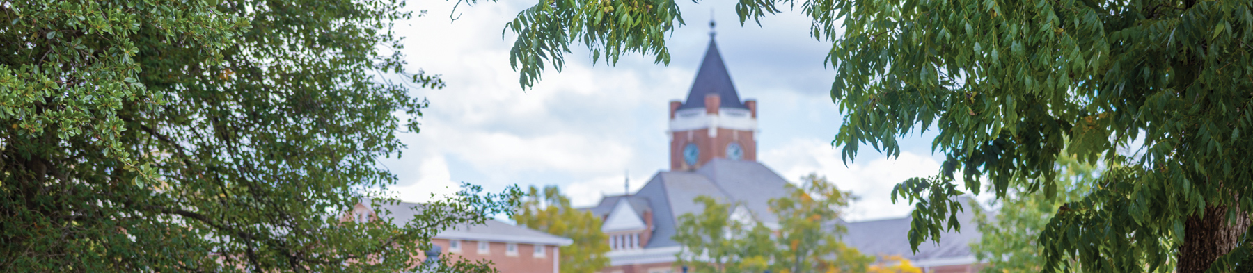
The old clock tower logo dates back to 1992 when Winthrop became a university — it predates the Internet's growth. The "WU" had been used around campus for 10 years. We quickly identified the importance of developing a logo that can be distinguished as purely Winthrop's — something impactful and distinctive. We also needed a logo that would be more visible in all media, including the small screens of mobile devices and one that could be more easily employed consistently by offices across campus.
The blue and garnet clock tower logo that was used from 1992 to 2018 has been retired and added to our collection of vintage logos and marks where it will remain a part of Winthrop history. The same has happened with the "WU" mark.
This new logo is uniquely Winthrop — including elements that are truly ours. The logo's new symbol features an eagle, inspired by our Winthrop Eagle statue on campus and representing our school mascot, backed by the shield found in our official university seal, which is used on diplomas and class rings. The word "Winthrop" remains, as it continues to be a strong identifier of our university. Students, faculty, staff and alumni all still love our "wordmark" because they felt it captures that Winthrop is a long-standing institution. They also strongly endorsed emphasizing our garnet and gold, and liked that the garnet used is darker and richer. The word "University" was increased in size to enhance the importance of the word itself in the logo and for more effective reproduction capacity across a variety of media.
No — the university's rebranding initiative did not affect athletics - it only pertained to our institutional brand. The Eagle Head and "Big Stuff" did not change.
The rollout of the new branding was planned as a multi-phased effort, carried out over the course of a few years. We saw some changes immediately, but full rollout will occur over time.
Following the launch, University Communications and Marketing held TLC "Brand Camp" sessions to inform faculty, staff and students on how to use the new branding and how we can help! If you missed these sessions but would like the slides or information from the Brand Camps, please contact Katie Price at pricek@winthrop.edu. Also, please check Printing Services' website for information on available templates and how to order certain items. For any questions, contact UCM at 803/323-2236.
The new branding is growing to encompass all parts of the university in some way. University Communications and Marketing is working with areas across campus to tailor the branding to maintain a consistent look and feel across campus.
Given the angle of the profile, the stylized eagle could have one leg or two, but only one is apparent in the design. We considered including negative space to create the appearance of two, but such a small line would cause significant challenges in reproduction of the logo, particularly when printed on a small scale or, for example, in embroidery. To avoid these issues and keep the logo as easy to use as possible, we decided it would be best to omit the space.
The Winthrop Bookstore is now selling merchandise featuring the new logo, both in-store and online. New items are added to their inventory throughout the year, so continue to check back by stopping in or visiting the website.
For any other questions regarding the project, please contact Katie Price, Director of Marketing at pricek@winthrop.edu.